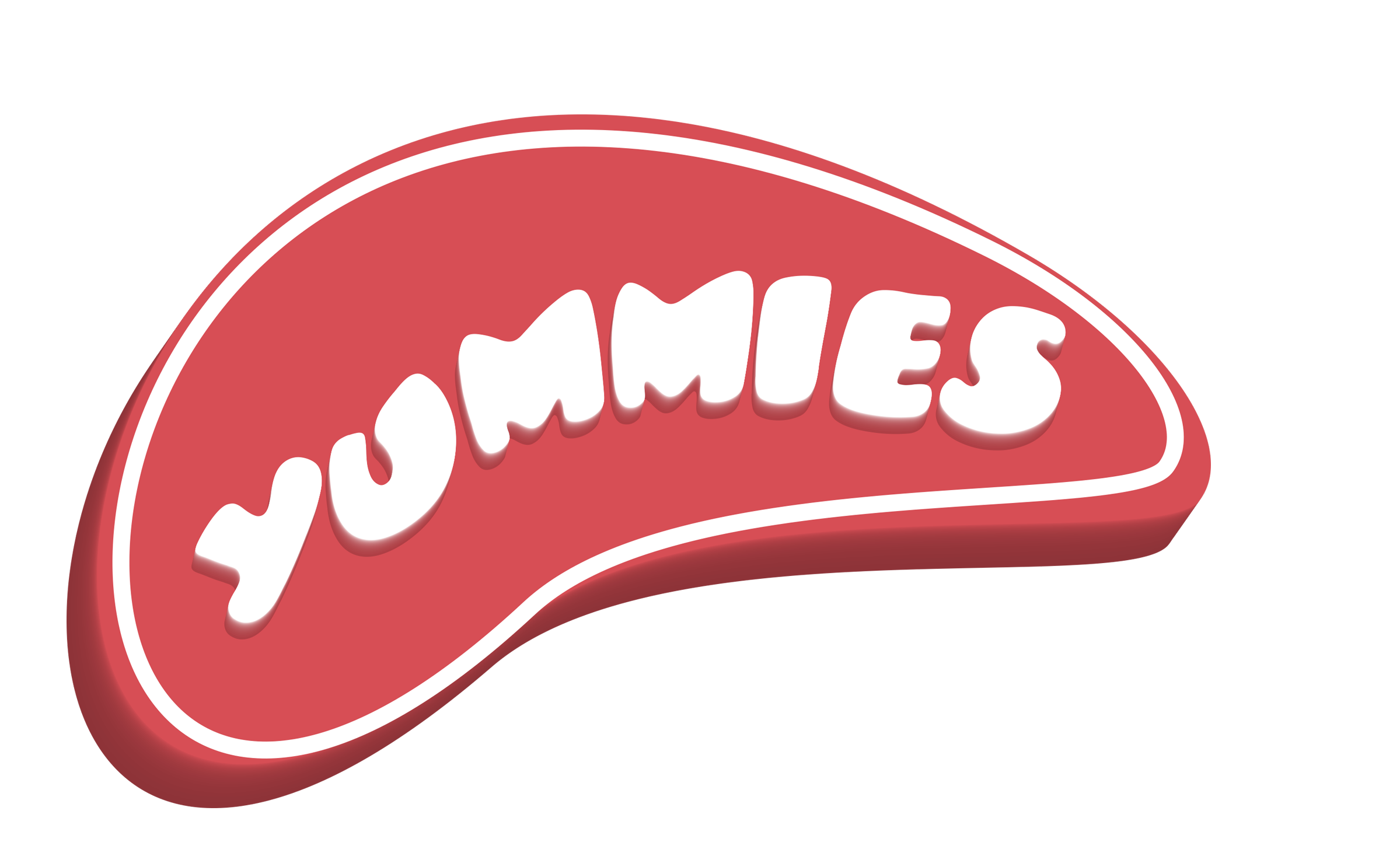
Yummies Intercontinental is thrilled to announce an exciting evolution of our beloved “Scoops” brand as we add a fresh, minimalist identity that blends sophistication with playful appeal. Embracing a vibrant red and white color palette and a striking chessboard-inspired design, Scoops is set to captivate families, children, and Gen Z with a modern, approachable, and mature aesthetic.

This is an additional font styling for the brand, which can be used in place of the official logo and vice versa. This marks a significant step in our journey to create a visually cohesive and memorable experience for our customers. The new design strips away complexity, focusing on clean lines and bold contrasts to reflect Scoops’ commitment to quality, fun, and inclusivity in places that matter. From our outlet signage to packaging and marketing materials, the red and white chessboard motif will bring a dynamic yet timeless vibe that resonates with all ages.
“We’re incredibly excited about this addition for Scoops,” said Philip Okoye, CEO at Yummies intercontinental. “Our goal is to create a brand identity that feels fresh, inviting, and versatile, appealing to the joy of families, the curiosity of children, and the trend-savvy Gen Z audience. This minimalist approach allows us to stay true to our roots while embracing a modern, mature look that we believe our customers will love.”
For the next few months, the additional Scoops branding will roll out across all outlets, products, and digital platforms as part of a trial phase. Customer feedback will play a pivotal role in determining whether this bold new look becomes a permanent fixture. We invite our loyal patrons and new fans alike to share their thoughts on this exciting change via our website, social media channels, or in-store.
Yummies Intercontinental remains committed to delivering delightful experiences and high-quality products that bring smiles to every generation. Join us as we scoop up a new era of fun, flavor, and connection with Scoops!
NOTE: This is an Alternative Font Design. Scoops has created or adopted a secondary typography style. This doesn’t replace the main brand logo font but provides an alternate look for use in specific settings (e.g., promotional posters, digital menus, signages, limited-edition packaging, or seasonal campaigns).